Your complete guide to Arcweave's Style Editor
Are you getting ready to participate in the upcoming Game Writing SIG Arcjam and want your game's look to match your narrative style?
The Style Editor of Arcweave's Play Mode gives you full control over how your prototype looks in regard to text styling, layout, and color palette.
In this guide, we'll go through every available CSS selector, show how it affects your Play Mode interface, and demonstrate simple, efficient examples of changes you can apply with ease.
Accessing the Style Editor
To open the Style Editor:
- Click the Play icon to enter Play Mode.
- Select the Style Editor (🎨 palette icon) on the top bar.
- Write your CSS directly in the panel; changes appear instantly.
- Press Save changes to save the CSS in your project.
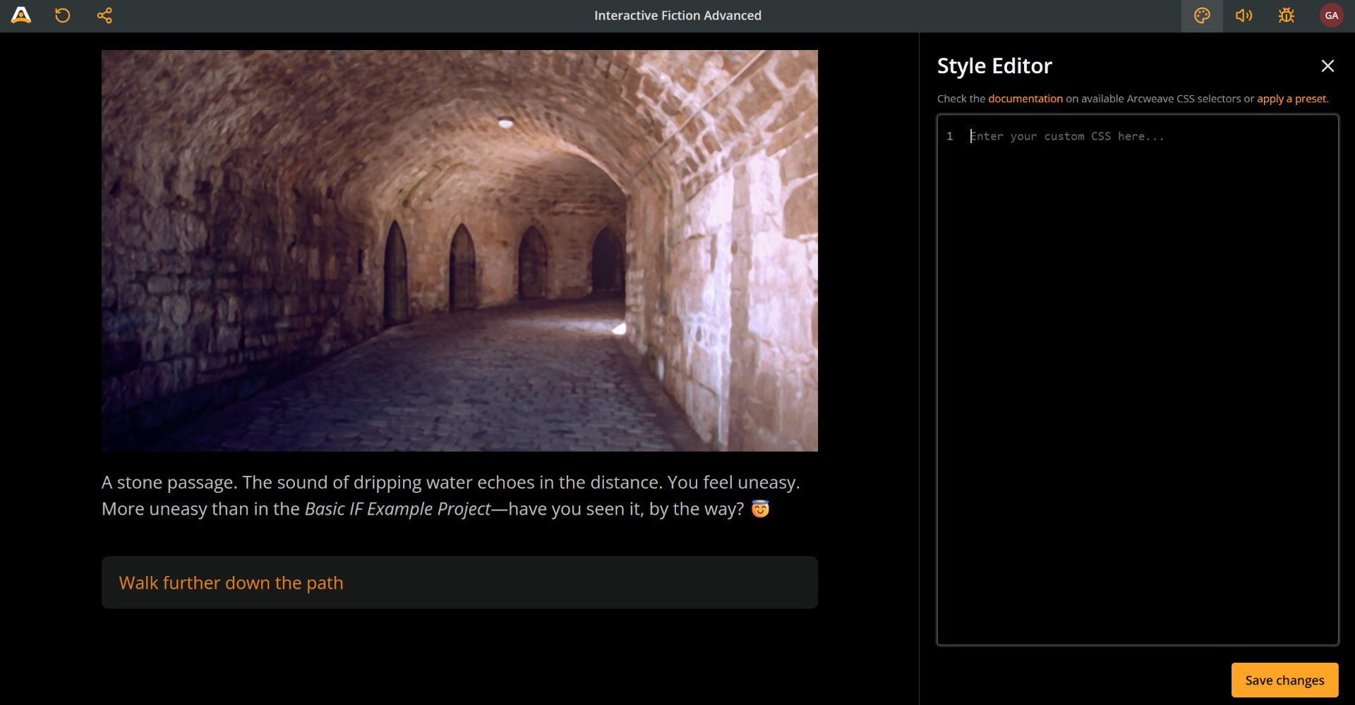
⚠️ If the "Save changes" button is disabled, fix any syntax issues!
Arcweave applies your styles live, and you can always reset or export them later.
Play Mode containers
Prototype wrapper
Every Arcweave prototype runs inside the prototype wrapper; think of it as the body part of your Play Mode, the outer container of it all. You can target it with the prototype__wrapper class.
🔍 Notice the double underscore
__used in the class names.
For example, you can use it to perform the following changes:
- Change the background color
- Add some padding at the top
- Change font
- Set the font as bold
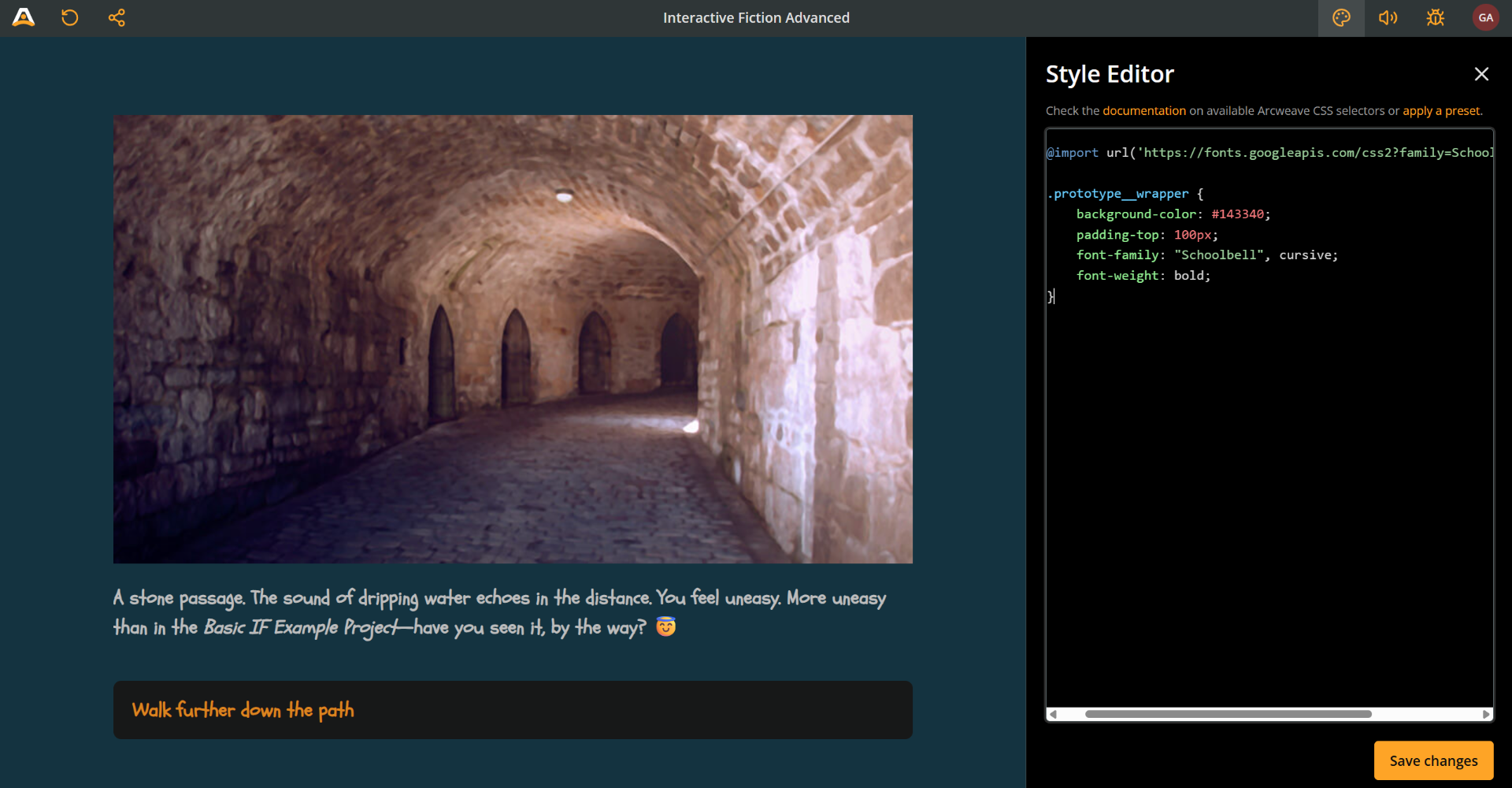
The code snippet for these changes is the following:
@import url('https://fonts.googleapis.com/css2?family=Schoolbell&display=swap');

.prototype__wrapper {
    background-color: #143340;
    padding-top: 100px;
    font-family: "Schoolbell", cursive;
    font-weight: 600;
}
💡 Remember to include an
@importdirective when importing fonts.
Prototype content
Your story's elements don't just float freely inside the prototype wrapper; they're organized within their own container called prototype content.
You can target the prototype__content class to control the display of the following parts of the rendered element:
- Header (cover image or video)
- Text content
- Option buttons
Use this class to make layout and style adjustments like the following:
- Make the prototype content narrower
- Change the color of just the content area
- Change font
- Add some margin around the content
- Add border radius (soft corners) to the content area
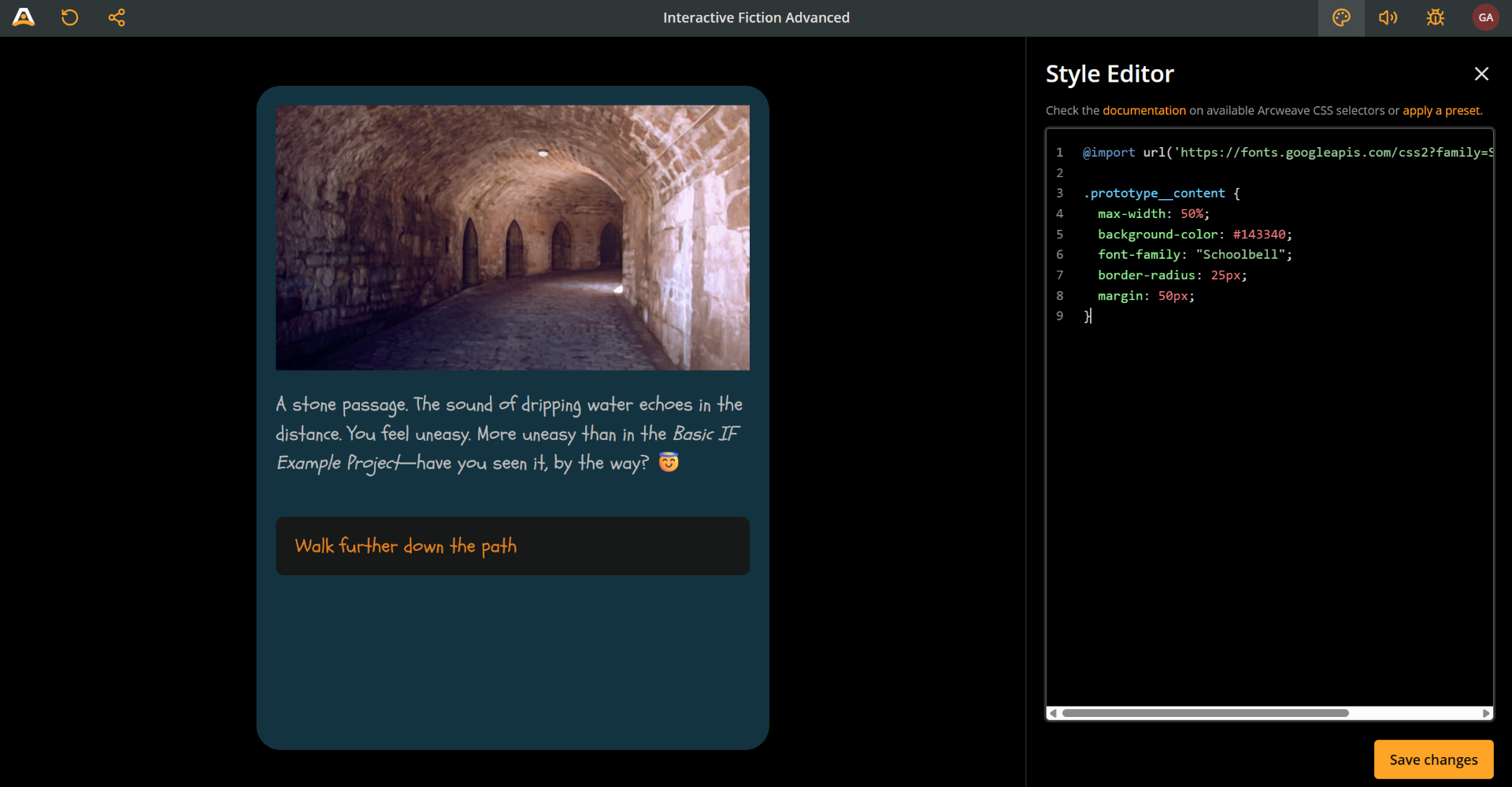
@import url('https://fonts.googleapis.com/css2?family=Schoolbell&display=swap');

.prototype__content {
  max-width: 50%;
  background-color: #143340;
  font-family: "Schoolbell";
  border-radius: 25px;
  margin: 50px;
}
✅ As you've probably noticed, you can change the font using either class:
prototype__wrapperorprototype__content. However, it's best practice to target the text content in the editor, as described in Styling text below.
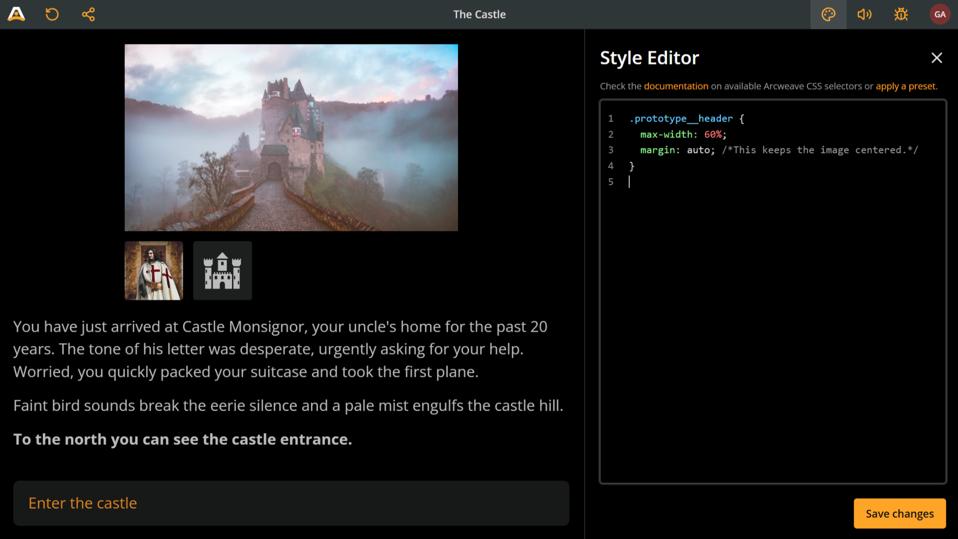
Prototype header
The prototype header is the area that holds the elements' following items:
- Image or video cover
- Attached components
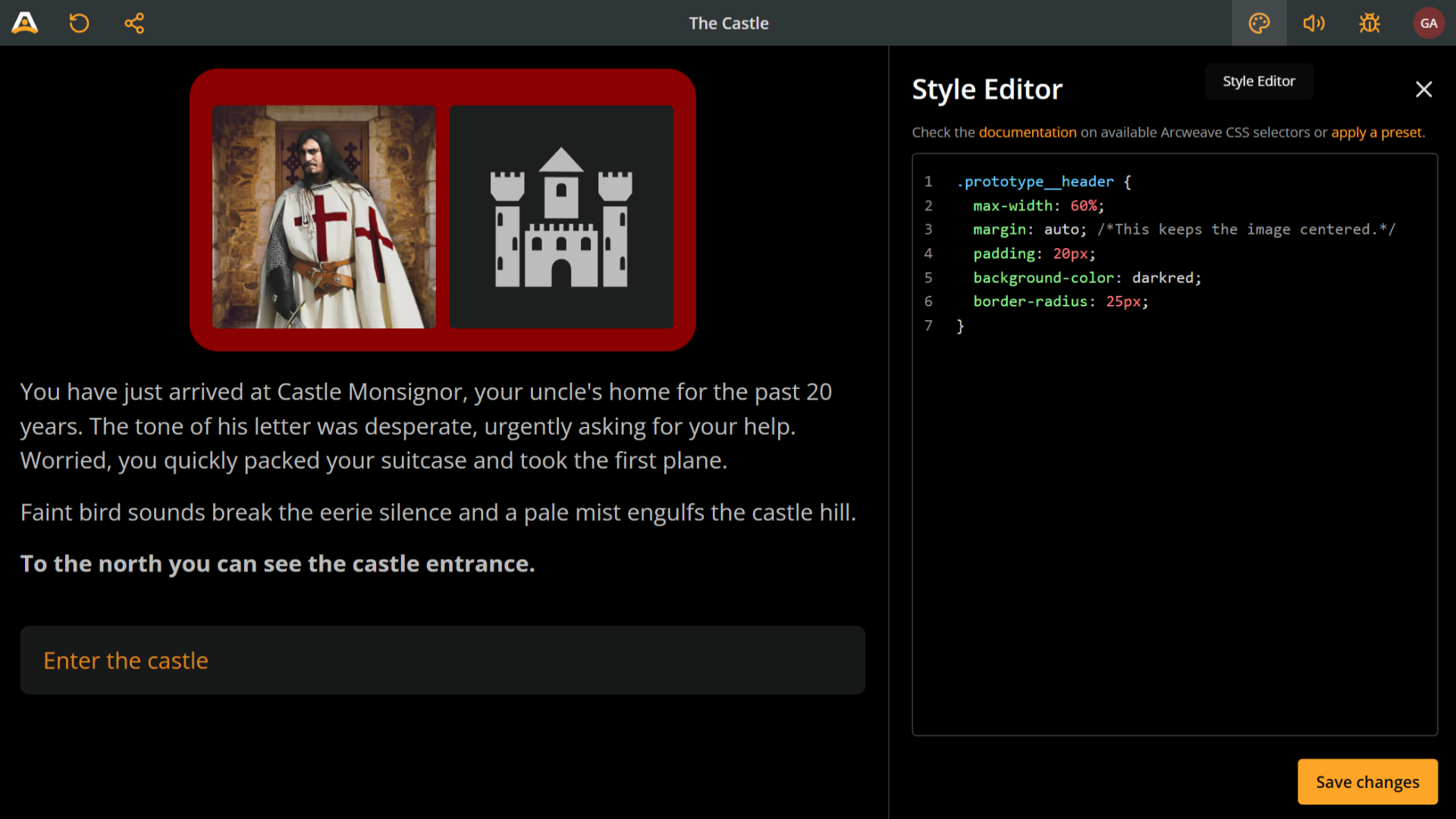
Target it by using the prototype__header class.
For example, to make the header area narrower than the text content, use the following snippet:
.prototype__header {
  max-width: 50%;
  margin: auto; /*This keeps the image centered.*/
}
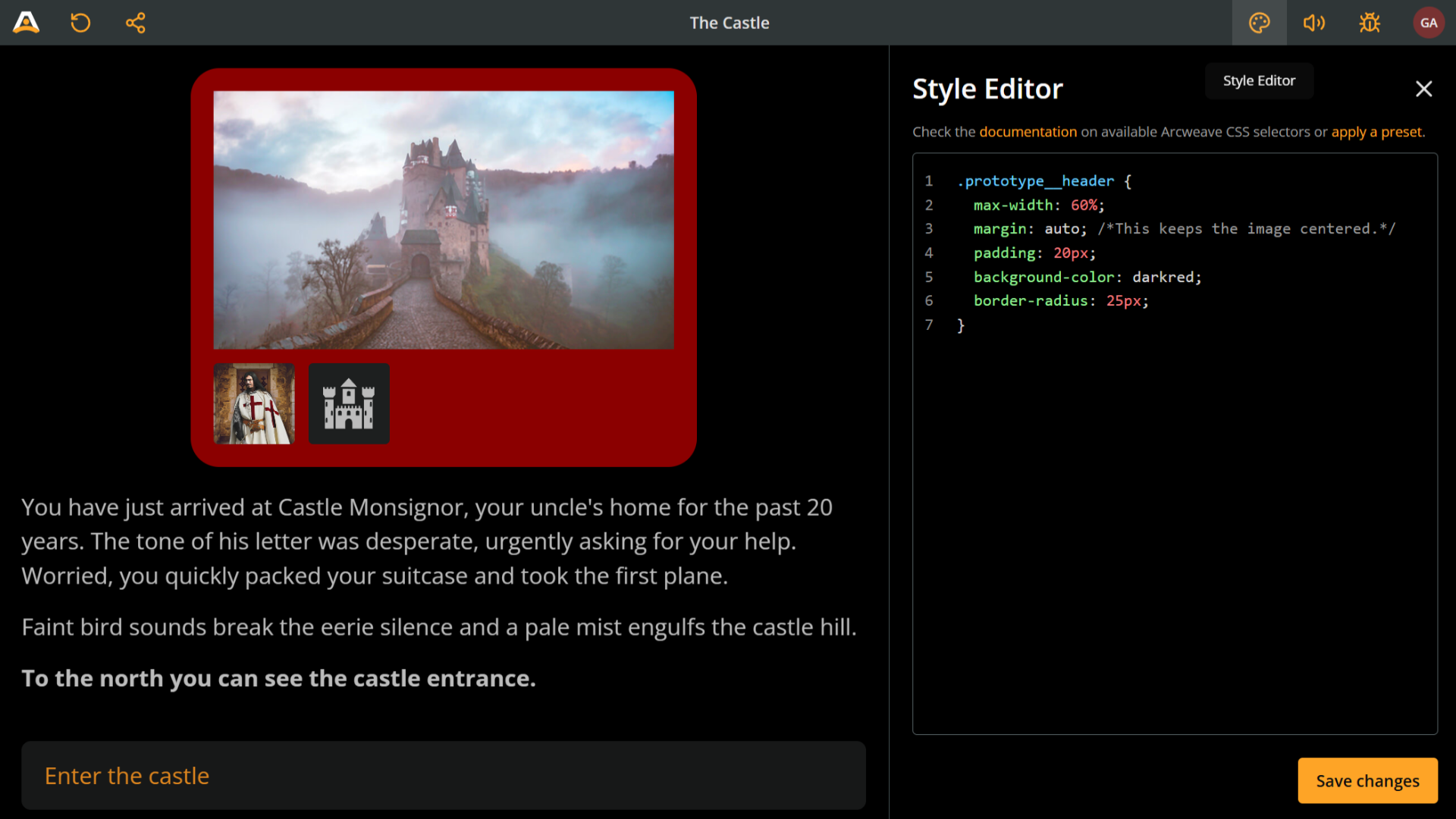
You can also color this area (and make corners rounded) with the following snippet:
.prototype__header {
  max-width: 60%;
  margin: auto; /*This keeps the image centered.*/
  padding: 20px;
  background-color: darkgreen;
  border-radius: 25px;
}
If an element has attached components and no image or video cover, the components will take the cover's place in the prototype header area.
Prototype body & prototype text
The prototype body contains the text content and the option buttons. The prototype text is a sub-container and contains only the text content. Target them using the classes prototype__body and prototype__text.
The following example uses a combination of these two classes to:
- Narrow the text / buttons area setting the
max-widthofprototype__bodyto95%. - Narrow the text content width setting the
max-widthofprototype__textto an extra90%. - Center both
prototype__headerandprototype__bodywithmargin: auto. - Set the text content as center-aligned, setting
margin: autoforprototype__text. - Change all background colors.
- Give them some padding.
- Detach them from each other using
marginandmargin-top.
🔍 Notice that centering the
prototype__bodyis not the same as setting the text to be center-aligned. Feel free to experiment with the code snippets, to better understand exactly what each property does.
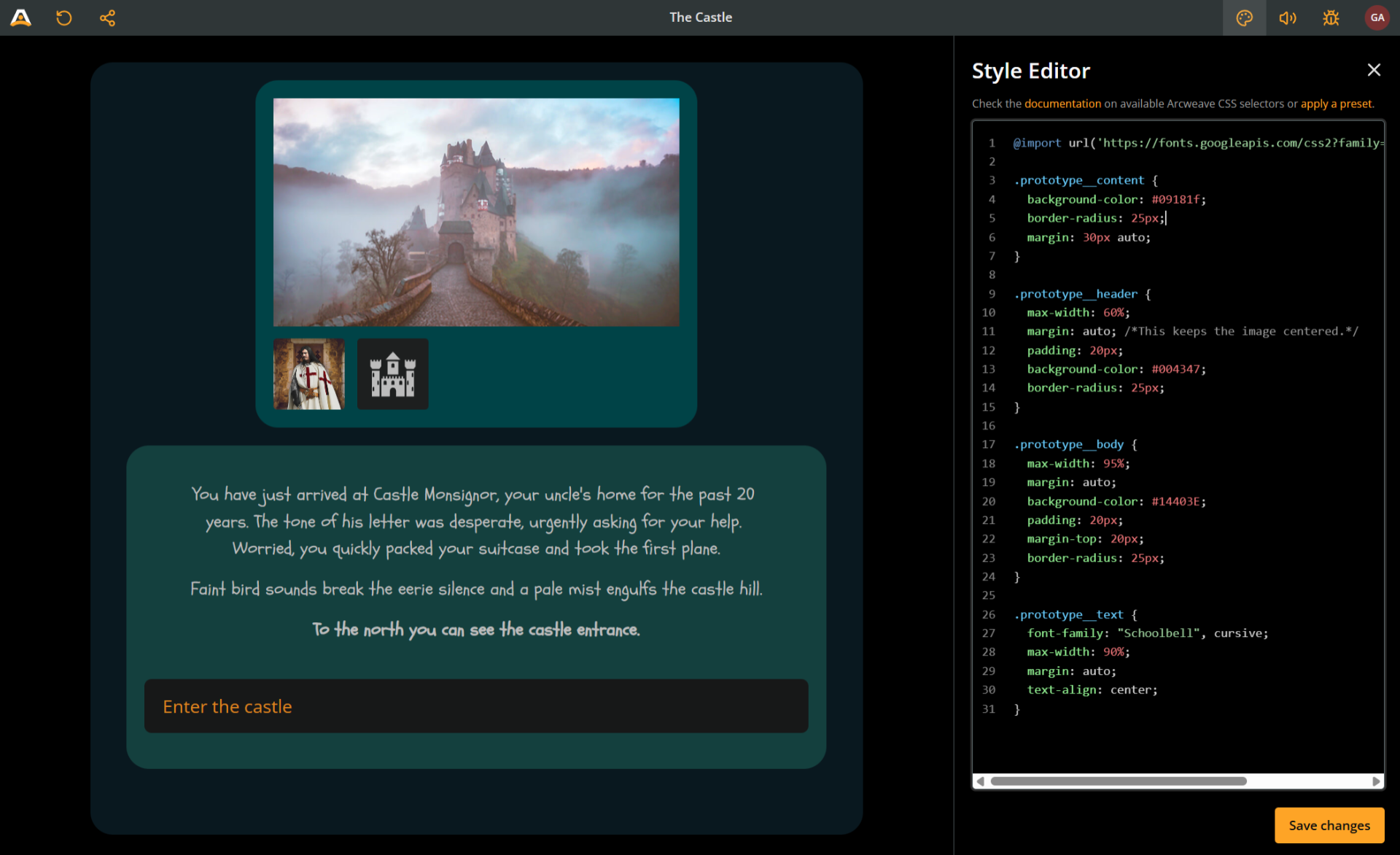
This is the code snippet that produces this result:
@import url('https://fonts.googleapis.com/css2?family=Schoolbell&display=swap');

.prototype__content {
  background-color: #09181f;
  border-radius: 25px;
  margin: 30px auto;
}

.prototype__header {
  max-width: 60%;
  margin: auto; /*This keeps the image centered.*/
  padding: 20px;
  background-color: #004347;
  border-radius: 25px;
}

.prototype__body {
  max-width: 95%;
  margin: auto;
  background-color: #14403E;
  padding: 20px;
  margin-top: 20px;
  border-radius: 25px;
}

.prototype__text {
  font-family: "Schoolbell", cursive;
  max-width: 90%;
  margin: auto;
  text-align: center;
}
Styling text
Although you can perform some text styling by targetting the containers described above, you need to target the text itself to go even deeper.
Editor
The editor is a sub-container of prototype text containing the rich text of your elements. It can be targeted using the editor class. This article contains a couple of cases where the editor comes in handy, the first one following right below.
Editor content
To target the text content of your elements, you need to call propotype text, editor, and editor content together. See the example snippet below, which increases the font size.
The main rich-text content sits inside .prototype__text .editor .editor-content.
The following snippet increases the font size of the text content and changes its color.
.prototype__text .editor .editor-content {
  font-size: 28px;
  color: darkseagreen;
}
Prototype media
To control the cover image or attached video display, target the prototype__media class as in the following snippet:
.prototype__media img {
  border-radius: 25px;
}

.prototype__media video {
  border-radius: 25px;
}
Prototype components
Components are contained in the prototype components container, which you can target with the prototype__components class. To target the components themselves, use the selector .prototype__components .comp.
Here's an example of targeting components and their container to manipulate their size and remove their default border radius.
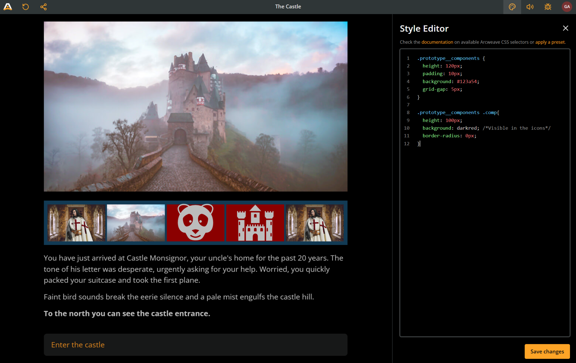
.prototype__components {
  height: 120px;
  padding: 10px;
  background: #123a54;
  grid-gap: 5px;
}

.prototype__components .comp{
  height: 100px;
  background: darkred; /*Visible in the icons*/
  border-radius: 0px;
}
If you wish to completely omit components from the Play Mode experience, use display: none:
.prototype__components {
  display: none;
}
Prototype option
Option buttons use the prototype__option class.
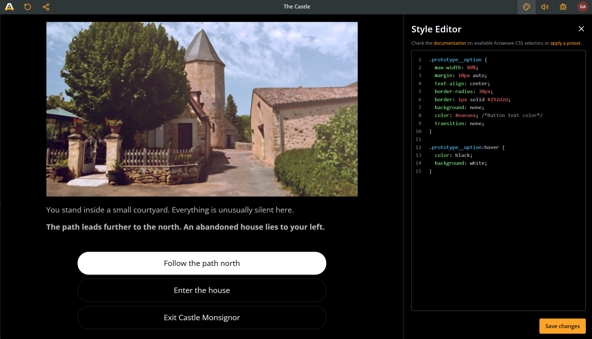
This example goes for a high-contrast, no-transition, rounded and centered buttons.
.prototype__option {
  max-width: 80%;
  margin: 10px auto;
  text-align: center;
  border-radius: 30px;
  border: 1px solid #292d2d;
  background: none;
  color: #eaeaea; /*Button text color*/
  transition: none;
}

.prototype__option:hover {
  color: black;
  background: white;
}
Targeting specific elements by their ID
Each element in your prototype has its own unique ID. This allows you to target specific elements by including their ID as a selector.
Let's break this down step-by-step.
1. Copy the element ID
An element's ID looks like this: 81a30674-aa09-4eb8-8484-59298d37f984. There are two ways to locate an element's ID and copy it to your clipboard:
In Play Mode:
- Play the story until you reach the desired element.
- Open the Debugger.
- Locate the element and its ID, near the Debugger's top part.
- Select the ID by dragging and press Ctrl/Cmd+C to copy it to your clipboard.
In the project environment:
- Locate and right-click the desired element in its board.
- Select Properties.
- Go to the Details tab.
- Next to Element ID, press the clipboard button.
2. Add the element ID to the CSS selectors
After copying the element's ID, prepend it to your CSS selector using the format #el-[element-id]. This ensures that your styles apply only to that specific element when rendered in Play Mode.
Here's an example showing how to target both the editor content and the prototype content of a single element:
@import url('https://fonts.googleapis.com/css2?family=Schoolbell&display=swap');

#el-81a30674-aa09-4eb8-8484-59298d37f984 .prototype__text .editor  .editor-content{
  color: darkseagreen;
}

#el-81a30674-aa09-4eb8-8484-59298d37f984 .prototype__content {
  max-width: 50%;
  background-color: #143340;
  font-family: "Schoolbell";
  border-radius: 25px;
  margin: 50px;
}
The Game Writing SIG Arcjam is now open for joining!
With these selectors and techniques, you can transform your Arcweave game into a polished, branded, and submission-ready interactive experience!
And remember: you're not alone!
- If you get stuck, the Arcweave community is here to help. Don't underestimate the value of reading the docs!
🎮 Happy writing, happy styling, and see you in the jam! 🕹️